7 Landing Page Mistakes That Quietly Kill Conversions

Explore more articles from The Omis Digital Blog.
You pay for traffic, but it does not turn into customers. Most of the time the problem is not the ad. It is the page. These are the mistakes we fix most often.
This post supports our complete guide to conversion-focused web design. Read that first if you want the full framework.
1. More Than One Call to Action
Too many buttons split attention. Pick one main action. Make everything else smaller or remove it.
2. A Headline That Says Nothing
Clever often beats clear, and that hurts. Your headline should say what people get. Use plain words. Make it clear in three seconds.
3. Forms That Ask Too Much
Every extra field costs you sign-ups. Ask for the least you need to start a chat. Get the rest later.
4. No Visible Proof
People do not trust claims. Add reviews, logos, and results near your button. Make the proof easy to see.
5. Slow Load Times
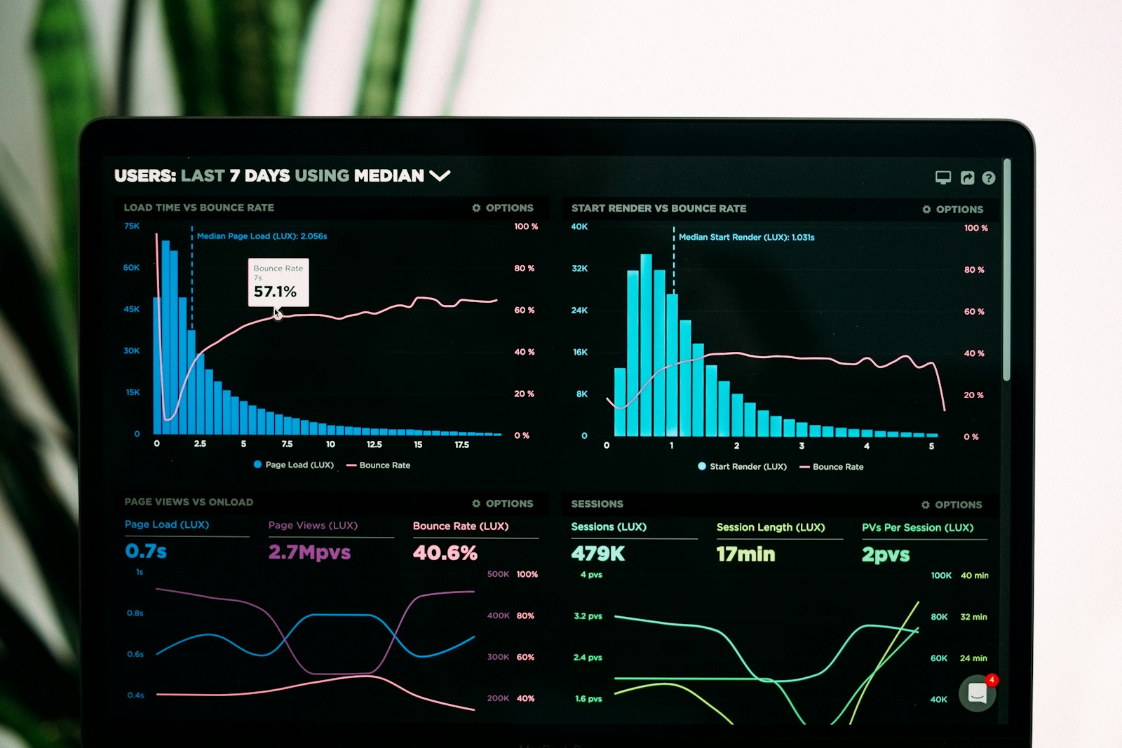
If the page is slow, nothing else matters. We go deeper in website speed and conversions.
6. Hiding the Offer
Do not make people scroll to learn what you do. Lead with the offer and the action.
7. Designing for Looks, Not Behavior
Pretty is not the goal. Guiding action is. Every section should move the visitor one step closer to acting.
Fix These First
Most pages improve fast once these are fixed. Want us to do it for you? See our web design services.