
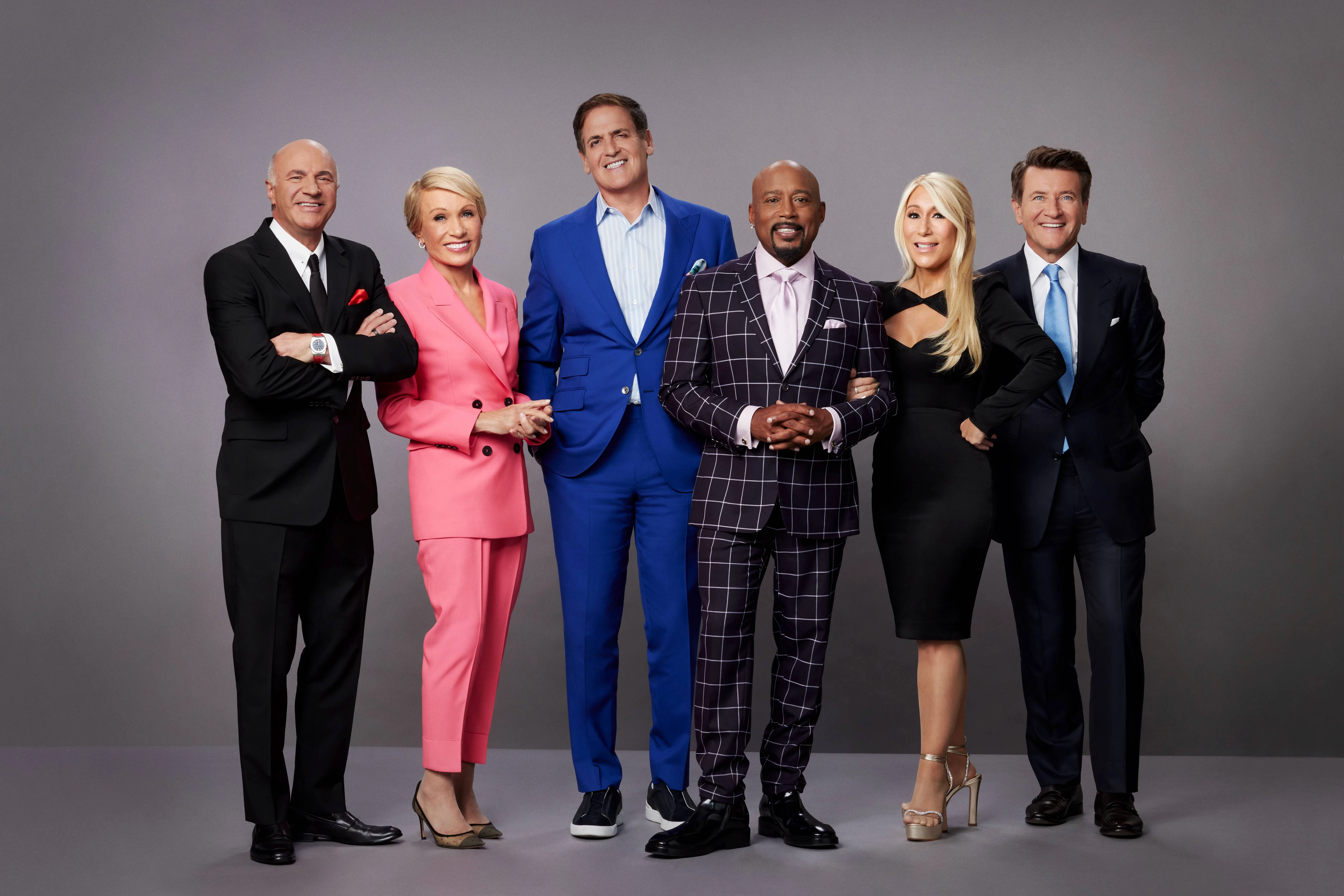
Ranking the Best Websites from Shark Tank

Author
David Sassower
Shark Tank website breakdown: design, clarity, and conversion
Shark Tank has launched some of the most successful companies in the world. But how well do their websites perform when it comes to design, clarity, and conversion?
At Omis Digital, our goal is to help you build modern, engaging websites that actually convert. Let’s dive into our rankings of some of the top Shark Tank product websites.
Scrub Daddy: A-Tier
Design:
Clean, simple, and visually distinct
Brand colors match packaging for strong recognition
Fonts and imagery align with playful, friendly branding
Clarity:
Tagline “Smile while you scrub” makes the purpose clear fast
Low reading level, easy to understand
Shop page could be better organized by use cases instead of technical features
Conversion:
Free shipping banner on orders over $30 encourages purchases
Checkout could be faster with a direct “Buy Now” button
Final Verdict:
A-Tier. Strong design and clarity, with minor improvements needed for shopping efficiency.
The Comfy: B-Tier
Design:
Sticks to black-and-white theme for brand consistency
Lacks contrast; CTA buttons blend into the background
Clarity:
Product description is clear
Repeats key info too much, making navigation feel cluttered
Conversion:
Shop Pay makes checkout easy
Better CTA button colors and improved product categorization would help
Final Verdict:
B-Tier. Solid foundation but needs design and messaging refinements.
Tipsy Elves: C-Tier
Design:
Energetic vibe, but the homepage feels overwhelming
Too many banners, CTAs, and menu options cause decision fatigue
Clarity:
No clear intro; visitors might not understand the brand’s focus (seasonal, ski, or novelty?)
Conversion:
Confusing navigation and messaging slow down purchase decisions
Weak, unclear CTAs hurt conversions
Final Verdict:
C-Tier. Needs a clear brand message and a simplified homepage.
Dude Wipes: S-Tier
Design:
Bold, cohesive, and well-branded
Black-and-white theme highlights product images
Clarity:
Instantly obvious product and purpose
Direct messaging and strong visuals eliminate confusion
Conversion:
High-quality videos increase engagement
Checkout has an extra step — a direct “Buy Now” CTA could improve it
Final Verdict:
S-Tier. Excellent branding, design, and clarity.
Cousins Maine Lobster: S-Tier
Design:
Clean, modern, and surprisingly sleek for a food brand
Interactive scrolling keeps visitors engaged
Clarity:
Immediate understanding of what they offer: fresh Maine lobster shipped to your door
Direct, effective homepage messaging
Conversion:
Smart email sign-up pop-up
Simple shopping flow makes purchasing easy
Direct-to-product landing page could further reduce friction
Final Verdict:
S-Tier. A masterclass in e-commerce and service hybrid design.
Key takeaways for your business
Lessons from these Shark Tank sites you can apply today:
Keep it simple. Overly complex designs hurt clarity and conversions.
Match branding everywhere. Consistent colors and visuals (like Scrub Daddy) build recognition.
Optimize CTAs. Clear, bold, contrasting call-to-action buttons convert better.
Reduce friction. Every extra step in checkout lowers conversions — add “Buy Now” buttons.
Leverage video. High-quality videos (like Dude Wipes) improve engagement and trust.
If you want a high-converting website for your business, these principles will help you attract, engage, and turn visitors into paying clients.
Ready to build a site that converts?
Contact Omis Digital — we specialize in modern, conversion-focused websites that drive real results.